First impressions are everything on the Internet! Studies show that a new visitor to a website takes an average of two to three seconds to form a first impression and make a decision if they will stay on the site to learn more about the business.
Think of your home page as your front-door greeter:
- Is it welcoming and inviting?
- Is it professional looking?
- Is it out outdated or current?
- Can a visitor find what they are looking for?
Your home page is one of the most important pages on your site so making the right first impression is critical. If someone doesn’t like what they see on your site, their initial reaction is more than likely to hit the “back button” to where they were before visiting your site.
If you’re thinking about giving your financial advisor website a face-lift, then be sure to factor in these top four website best practices into your home page design.
1. Design Around Your AudienceYour RIA website should be both visually appealing with imagery that resonates with your target clients (personas) as well as have content that speaks to them directly.
When a visitor lands on your home page, they should immediately get a sense of:
- Who you are
- What you do
- What you can do for the visitor
Many RIA websites that we analyze miss this part of the home page design. Having a compelling value proposition is critical to keeping visitors on your site longer than a few seconds.
Example 1: Let’s say your target personas are couples either getting ready to retire in five to 10 years or they have already retired. When a visitor lands on your site, they see pictures of young families and/or young professionals aged 25 to 40 and the content is very generic about setting goals and financial planning. This would be a design “miss” as your key personas are not represented with visual imagery or relatable content.
Example 2: Your key personas are women in various stages of life. Your site should have imagery of women and your content should be very specific about who you work with (women) and how you can help them. This would be a design “hit” as it speaks directly to your personas and it’s easy for a visitor to grasp who you work with and what you can do for them.
- Jargon-free content that is easy to understand
We know that financial services (planning and investing) can be very confusing to investors so you want to ensure that your home page is free of any financial jargon that might confuse visitors.
There are ways to sound like an expert without having to use terms or jargon that is too technical for the typical visitor. What you don’t want to do is turn people off because they think your services are too complex for their needs or they are intimidated by the whole financial planning/investing process so they opt to leave the site entirely.
Remember that investors are going through a process of exclusion during their search for a financial advisor when they hit your site. Don’t exclude yourself by using complex content that visitors won’t understand.
- Drive interest with calls-to-action (CTAs)
One of the primary design features on a home-page should be to get visitors to engage more with your site by viewing additional pages. CTAs are the best way to get people to engage with your site. Examples of some CTAs include:
- Learn More
- Have a Question?
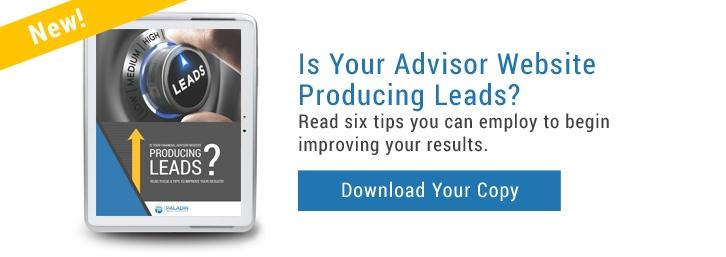
- Download Your Free Copy
- Schedule a Call
- Let’s Talk
- Subscribe Now
These CTAs can drive visitors to deeper content pages on your site that explain your services in more detail. They can also drive visitors to a landing page where the visitor can submit a limited amount of data to you in return for something of value to them, such as an eBook, newsletter subscription, free consultation, etc.
CTAs are the key to building an effective lead generation website for your financial advisory firm.
- Keep it simple!
So many of the sites that we look at have one glaring, but easy to fix problem: Fonts! The type of font style you use, along with font color and font size can have a big impact on a visitor’s time on your site.
- Demographics: Know who your intended audience is, including their age and interests. Your font should engage with your target audience.
- Legibility: To get and hold a reader’s attention, be sure to use a font that is legible and easy to read. Use more decorative or eye-catching font styles for headlines, CTAs, and/or titles where you want to get a visitor’s attention.