A New Leading Indicator of Stock Market Direction
A new leading indicator of stock market direction is pointing down right now
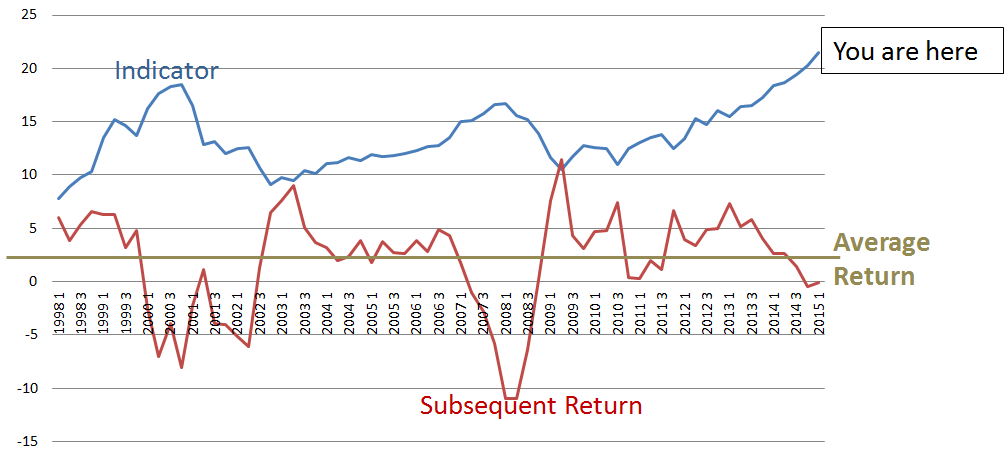
I just discovered a new leading indicator of U.S. stock market direction, and I’d like your thoughts on its efficacy. The following graph shows the history of the indicator going back to 1998. It forecast the market declines in 2000 and 2008, and is currently forecasting another market correction. A high indicator precedes a market sell-off. A low indicator signals a recovery, and a flat indicator is a predictor of average returns. The returns shown in the graph are the average quarterly returns over the year following the indicator date. They’re rolling 4-quarter averages.
The Indicator
I created and maintain the Surz Style Pure® indexes that break the stock market into large, middle and small, and within each of these sizes into value, core and growth. Morningstar style boxes use a similar approach, and were introduced several years after I launched my indexes. My index definition for large companies is the top 65% of the market. I sort the 6000 companies in the US stock market by capitalization and start adding until I get to 65% of the total capitalization.
I’ve recently noted that the breakpoint for large companies has recently reached its highest point ever -- $22 Billion. A large company by my definition is currently above $22 Billion. There are currently 227 U.S. companies that meet this rule, with total capitalization of $16 Trillion, which is 65% of the $25 Trillion total market size. This large company breakpoint is the indicator shown in the graph above. It has successfully predicted the last two market cycles, and is signaling that a major market decline started last year with more to come.
So why does this breakpoint indicator work, and most importantly will it work this time? Here are some possible explanations:
- Mega cap market domination is cyclical, and the (capitalization-weighted) market goes where the megacaps go.
- It’s just another measure of overpricing, big companies becoming too expensive.
- Investors flee to the safety of big companies when they’re worried, and worry ultimately turns into panic.
- It’s not a leading indicator at all. The apparent correlations are spurious.
What do you think?
Have I stumbled onto something?
What is it telling us about 2016?
Ronald J. Surz is a partner and CIO of Paladin Financial Technology. He is also president of PPCA Inc. and Target Date Solutions and a partner of TDF Builder, and Sortino Investment Analytics.


